COVET ME: All our fave Euro 2020 kits
There are cool football fashion bits dropping all the time so instead of just raving about them in our private team group chat and in print twice a year (a double spread isn’t enough!), we’re going to share why we rate them in real-time here.
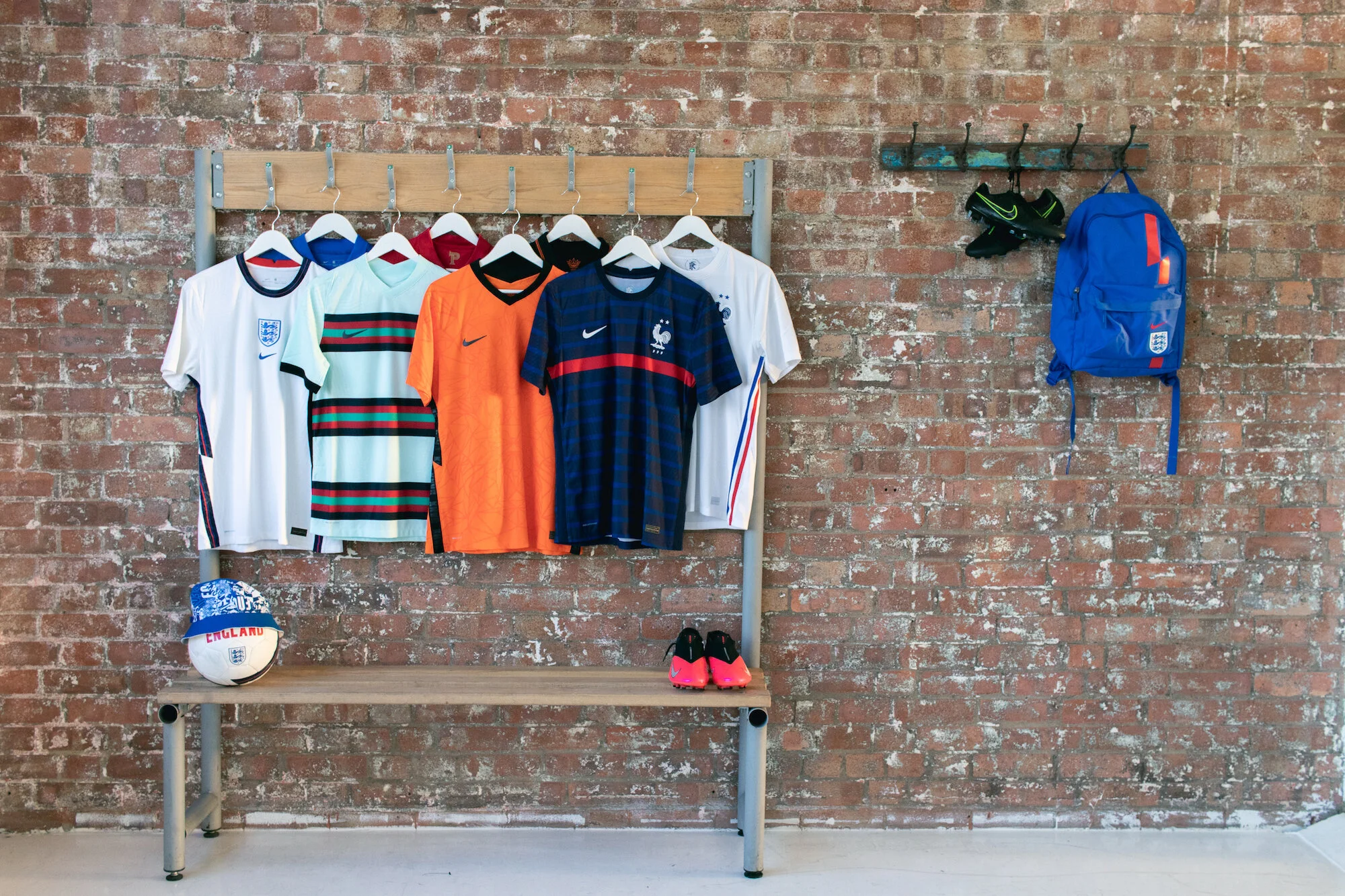
The Nike Euro 2020 kit launch in March was a subdued affair. No athletes, interviews via video link, and an air of uncertainty about coronavirus and its wider impact. In the middle of this, the kits and accessories of Nike’s European national teams stood out in the studio, accompanied by a large and cubic sustainability structure made with empty water bottles. The European Championships obviously got pushed back and so did the kit drops, until now.
Did we predict bucket hats? Damn straight. Were we right? Yes. Nike made a one in that cult green chevron for the Nigerian 2018 World Cup launch and our Fashion Director Georgina Hunt makes the sickest bucket hats from upcycled kits including England. Others do too so it’s definitely a trend at this point.
It’s always difficult to tell what direction Nike will go with, oscillating between template-type kits, nostalgia, and visionary design, so we asked Scott Munson, VP of Global Football Apparel, to give us the inside track. ‘Gareth Southgate talks a lot about the “new identity” of the England team. That’s why we have this ying/yang of a classic with some premium details and the away (shirt) which is a bolder, fresher expression.’
The contrast works. The designs are simple yet significant. The Three Lions crest, drawing from a racially diverse team, has evolved into “a community of lions.” Why is it so important for Nike to represent the diversity of England and of football more broadly? And what might this mean for our female kickers? ‘Everything we do in the innovation is both male and female.’ He’s quick to point out the three years of research and design that goes into making the finished product. A lot happens, from scanning athletes bodies to gathering insights. ‘It’s very collaborative. We’re talking to consumers, influencers in the areas of fashion and football, players and the Federation. We don’t want to rush the process.’ Then it’s a stamp of approval from the Football Association.
Our highlight? The strong reference to beloved 90s shirts in the detailing. Here, the SEASON team selects their favourite jerseys from the Euro collections.
England (Away)
‘I must say, being Welsh, I never thought I’d like an England jersey this much! This away strip is so blue and beautiful. I’m getting the 90s feels, with the pattern and collar reminiscent of classics from the Umbro days. Nike clearly takes inspiration but brings it into the future in its own way, with the bold combination of mega blue and red – colours sure to pop on the pitch! I’m digging how the three lions crest is elevated with the all-red stitch, and the matching ball.’ Kelsey Lee-Jones, Editor-at-Large
The Netherlands (Home)
‘Another iconic kit for the Dutch, love the continuation of their iconic vibrant “Oranje” and contrast black detailing. With the women’s team winning the Euros and getting to the women’s world cup final could this be the kit to take the men’s team out of their wilderness? I love the knit design in this shirt, what looks like a graphic pattern from a far is actually asymmetrical face of a lion that soars through the knit of the shirt. A clever and patriotic feature that I’m really looking forward to see perform on the pitch.’ Georgina Hunt, Fashion Director
Portugal (Away)
‘This is what happens when national football federations are open to jersey design risks and Nike oblige with magic. Lifting the teal tone from Portugal’s Euro 2016 away shirt for the centre stripe of five, flanked by red and graphic black, I’m into the light blue base hue and lack of Portugal flag green. The colour combination is unexpected but refreshing, and bangs even more because of the way the three thick stripes are spaced out – Cristiano Ronaldo and co will look great in this. Bold, forward-thinking and not nostalgic, which is cool but so overdone, it’s very fitting for the defending European champions.’ Felicia Pennant, Founder and Editor-in-Chief
France (Home)
‘Nothing exudes confidence like a sleek minimalistic look worthy of world champions France. One thing I love about this retro look of this French kit is how it is bound to pop on the pitch. The use of red and blue creates a sense of companionship for French football lovers and will surely be worn off the pitch by many, whether dressed up or down!’ Judith Rita Nanyonga, Social Media and Marketing Coordinator
Norway (Away)
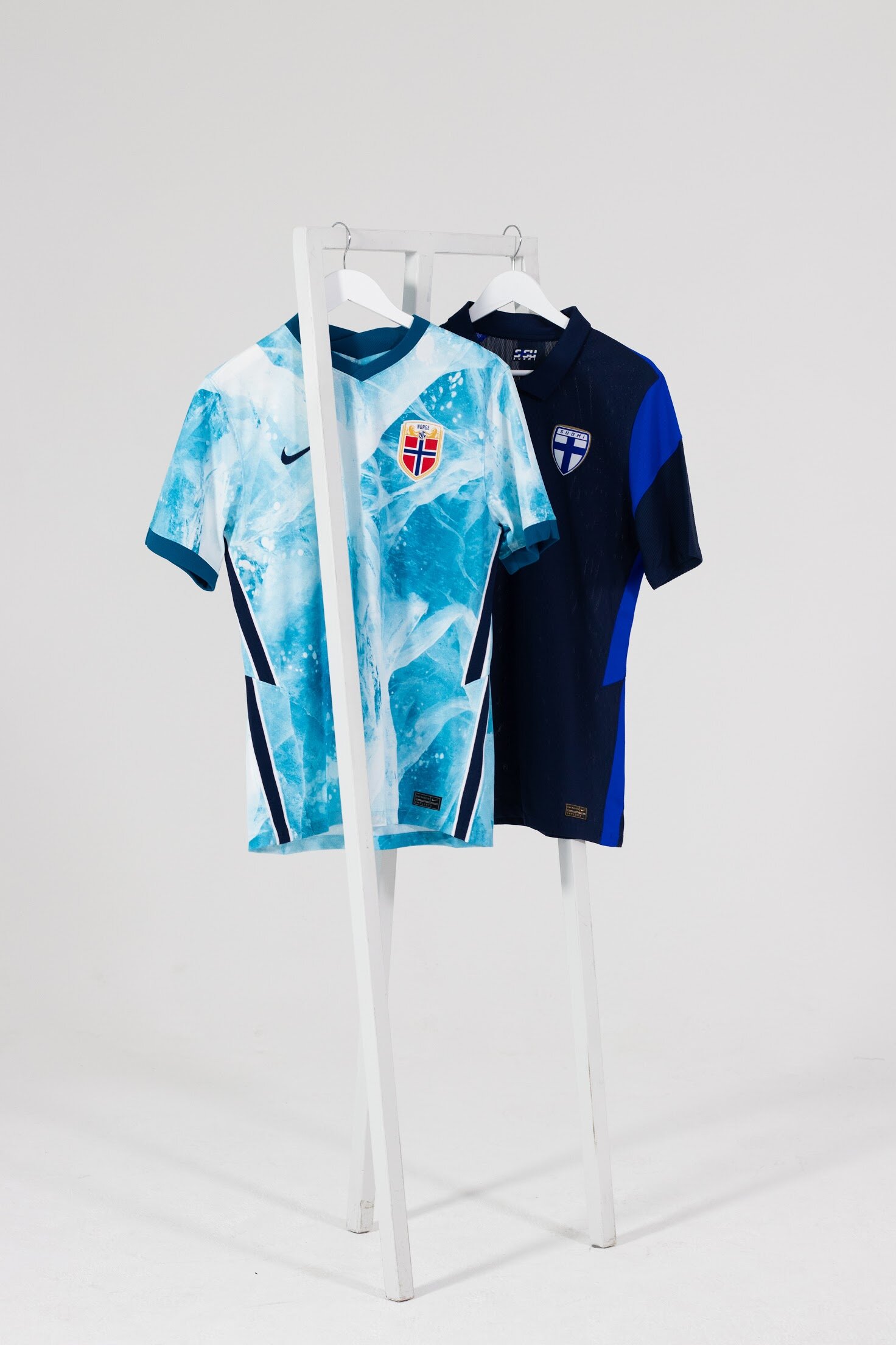
‘Nike has rabona’ed into second gear with this shirt. It’s reminiscent of ocean waves, an homage to Norway’s most beautiful beaches. The first thing I thought was: this is cool. Also, Scott confirmed this as a standout shirt, so I’m riding on that wave. There’s a detail and artistry, a calming colourscape that looks like something out of a painting. The red crest is bold against the blue/white scheme and the snazzy, navy line details really work. The men’s team will be looking to make their mark on this tournament and hopefully the women can get back to winning ways in it too.’ Maudlyn Nwagwu, Writer
Words Maudlyn Nwagwu
Photography Judith Rita Nanyonga and Nike


